SLA
SLA
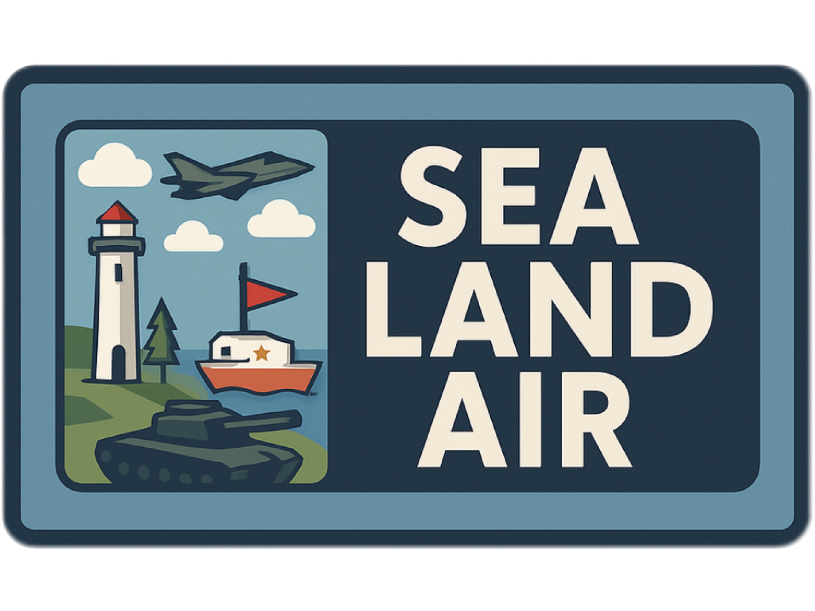
Directions
Scene 1 (Main Menu) : Main Menu Scene - Click the Start button to enter the game. Click the Overview button to view the brief introductions of the three game scenes. Click the Credit button to view the detailed information of the game creator. Click the Setting button to control the size of the background music and click the size of the sound effect. Click the Help button to view the game description and help information.
Scene 2 (Boat) : Sea Scene - Players drive boat shuttling among multiple small islands to simulate the floating of real water bodies. This mode emphasizes the combination of flexible movement and survival challenges.
Scene 3 (Tank) : Land Scene - Players drive the tank in the battlefield composed of forests and camps. Players need to kill the targets and test their operational reactions and movement strategies.
Scene 4 (Warplane) : Air Scene - Players will control the warplane in the scene and conduct high-altitude shooting through lifting, turning and advancing. This scene highlights stereoscopic maneuvering operations and aerial shooting.
Game Scene (Scene 2, 3, 4): There is score information in the upper right corner of the screen. On the left side, there are time information, player health information and two buttons. The Setting button can be used to replay the game and return to the home page. The Help button can be used to view player control information and monster information. There is a panel at the bottom of the screen, which contains a scene introduction and two buttons for switching scenes.
UX and UI discussion
1. Clean and Clear
The interface is minimalist, focusing the player's attention on core interactions such as shooting and movement. All menu buttons are clearly labeled with intuitive operations and are adequately spaced for comfortable tapping. The game HUD shows the score, time, and health points clearly visible.
2. Visual Consistency
All scenes adopt a consistent low-polygon cartoon military style. Buttons adopt a unified pixel art style with rounded borders and light red tones, which complement the wooden UI panels. Fonts and icon sets are consistent across scenes, maintaining a coherent visual image.
3. Hierarchical Layout
Priority functions such as "Start Game" and "Reset" are located at the top or center for quick access. Related UI elements are grouped together, such as the "Move", "Rotate", and "Scale" controls in the edit panel. The menu hierarchy avoids deep nesting; all key functions can be completed with just one or two clicks.
4. Feedback and Visibility
All interactive buttons have hover animations and click-to-zoom effects to provide instant feedback. Actions such as scoring, losing a heart, or winning trigger visual and audio cues. Victory and Game Over screens use full screen popups with clear results and next buttons.
5. User Control and Freedom
Players are free to select any scenario from the main menu, with no forced order. A "Reset" button is always available in edit mode to undo accidental changes. Menus allow players to quit, retry, or switch scenarios without penalty or loss of progress.
6. Accessibility and Guidance
Help screens with visual icons ensure new players get clear cues right away. Directional cues help guide player interactions naturally. Settings panel adjusts music/volume for comfort and customization.
Submission of Assessment 3 for PROG2001.
Sillin, Team SLA.
Comments
Log in with itch.io to leave a comment.
I really liked how each scene had its own personality but still felt like part of the same game. The pacing was nicely balanced—air felt fast, land was more strategic, and sea was calming but tense. Switching between them from the main menu was seamless. It made the game feel modular but polished. Even though the concept is simple, the variety kept it fresh. Really enjoyable!
The control system is super clear! I really like how the buttons are grouped—MOVE, ROTATE, SCALE makes everything very logical. As someone who doesn’t usually play 3D games, I didn’t feel lost at all. The HELP screen is really helpful too, especially the visual keyboard icons. It’s great that you included a RESET button, so I could freely try different moves without worrying. That gave me confidence to explore and experiment. Smooth, clear, and friendly for beginners!
The warplane scene delivers a great sense of vertical freedom. I love how the controls let you smoothly rise and descend—using space and control keys felt very intuitive. The floating enemies add a nice challenge, especially when trying to line up a perfect shot while still in motion. Visually, the mountains and runway give the scene a strong structure without getting in the way. It really feels like flying through a training zone in a stylized airbase. The camera angle is well-balanced too—I always had a good view of where I was going.
The flying mechanics are really fun, and I enjoyed the open feel of the sky area—but I did sometimes lose my sense of direction. Since the space is so open, it might help to add a small compass or floating waypoint marker that shows where enemies are spawning, or where the edge of the map is. That way, players won’t accidentally fly in circles or miss out on the action. Just a bit of orientation feedback would make the whole experience even smoother!
I really enjoy how cohesive the visual style is across all three scenes. The cartoon-military vibe is clear and consistent, from the red stars on the tank to the layout of the buttons in the UI. The use of pixel-art textures combined with soft-colored backgrounds creates a fun yet readable interface. What stood out to me the most was how easy it was to navigate—the controls were exactly where I expected them to be, and the feedback animations made it clear when I had clicked something. Great job making everything feel smooth and user-friendly!